Search Here

Friday, February 25, 2011

Yellow Stuff


Quilting is sometimes a winding road of mistakes and setbacks. For those of us who at times get frustrated, here's a megadose of encouragement from an incredible woman. Meet Diane Rose of Waco, Texas, USA. What determination and strength of character.
"Be of good cheer. Do not think of today's failures, but of the success that may come tomorrow. You have set yourselves a difficult task, but you will succeed if you persevere; and you will find a joy in overcoming obstacles. Remember, no effort that we make to attain something beautiful is ever lost."
— Helen Keller

First Quilt

It's always fun to see a quilter's first ever quilt. Here's mine from 1989, a traditional 12-block sampler designed by Diane Schneck.

If you appreciate traditional blocks, please take six minutes to enjoy these delightful dancing quilt blocks in a video created by Gayle Thomas. ENJOY! I think I'll watch it again.

Saturday, February 19, 2011

Branching Out


Left to my natural inclination I would always design a symmetrical quilt, and often one with radial symmetry. But one day I pushed myself to branch out into the uncharted territory of asymmetrical design. This is what I came up with.


For the entire quilt I chose to use each fabric for only piece. For example, this flower is made with five wine colored fabrics (same overall look but different fabrics). It adds interest.

Sunday, February 13, 2011

Yellow Stuff

Yellow means DRIVER BE ALERT on this winding road in San Juan, Puerto Rico. It was easier to paint the rocks than remove them!


My husband just returned from a short trip there and got to visit the historic district of Old San Juan where the narrow streets are paved with blue cobblestones. Evidently the stones were made with European iron furnace slag that was part of the ballast of the sugar carrying ships.

Tuesday, February 8, 2011

Chromatic Transitions

Back to my latest quilt, Chromatic Transitions (Feb 1, 2011 post). As you can see in this work-in-progress image, there are a number of places where a foreground shape is attached to two or more different background fabrics.


The following pieces (shown from the back) are examples. The foreground shapes are backed with Wonder Under fusible web. Using an X-acto knife I gently sliced halfway through the release paper to expose the part of fusible I was ready to work with. That way I could fuse the piece to its loosely cut background before cutting away the extra fabric.


A lightbox is invaluable for accurately trimming away waste.


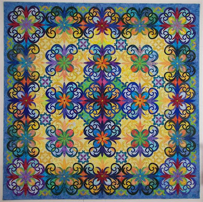
The finished quilt . . .

Saturday, February 5, 2011

Yellow Stuff


Since I live with someone who grew up in steel country (Pittsburgh, PA) yellow and black are the colors for this weekend as the Pittsburgh Steelers confront the Green Bay Packers in the Superbowl.

Created in 1975 by then Steelers radio broadcaster Myron Cope, The Terrible Towel is widely recognized as a symbol of the Steelers and the city of Pittsburgh.

Proceeds from sales of the Towel have raised over US$3 million for a Pennsylvania school which cares for people with mental retardation and physical disabilities.

The current manufacturer of the Terrible Towel is McArthur Towel & Sports Co., in Baraboo, Wisconsin. Can you spell IRONIC?

With insincere apologies to Packers fans . . . GO STEELERS!

Tuesday, February 1, 2011

Chromatic Transitions


Here's my most recent quilt. Chromatic Transitions will debut at Mid-Atlantic Quilt Festival, Feb 24-27 in Hampton, Virginia. The design is adapted from a late 1800's tile by Minton, Hollins & Co.

One design unit is composed of four "tiles" pivoting on center. My starting sketch included a grid of 25 of these units of four. If the values (light, medium, dark) for each unit were identical the quilt would have a pleasant but static appearance.

Instead, by using tracing paper overlays on the sketch I used a soft pencil to play with the placement of values, deemphasizing some of the individual shapes and thereby creating new centers of attention. A whole new design emerged. The next step was color/fabric selections to give further life and depth to the design.

The following detail shots illustrate the reason for the title. Chromatic Transitions is simply a classier way of saying color changes.