Search Here

Tuesday, March 19, 2013

Juicy Orange

Crystal Fire is a strong visual example of contrasting colors: orange and blue, yellow and purple.
The predominant color in this bold little quilt is orange. (detail of Crystal Fire)

Orange and yellow are two colors often used to create a glow as seen here in Tropical Radiance.

In this compass clock, orange provides a strong support for the dark blue hands indicating 5 o'clock. (detail of 24/7)

In the upper left corner, the dark blue quilting around the perimeter of the orange "X" helps the color stand out more distinctly against the background.

Here again blue and orange make a happy marriage. Opposite really do attract.

Tuesday, March 12, 2013

The Color Purple

Though opposites on the color wheel, purple and yellow complement and enhance each other. A Matter of Perspective is a predominately purple and yellow quilt.
Blue and burgundy work with purple to round out an analagous trio, while yellow is mixed with gold and orange.

Purple is positioned in Hybrid between it's parent colors of blue and red.

Purple thread creates an orchid outline in the background (upper right).

In Arms of Love, repetition of the large purple applique shapes are somewhat balanced with a smattering of purple squares in the border.

Red and gold in fabric and thread give definition and contrast to several shades of purple fabric in these feathers.

Wednesday, February 27, 2013

Greenies

Plant life in our world is filled with the color green. How many tints and shades of green fabrics do you have in your stash?
Some greens are warm and subtle. (detail of Buttons on Board)
Other greens are bright and crisp. (detail of Molecular Material)

Bright green fabric can make a bold statement. (detail of The Gathering)

At other times it takes just a hint of screaming green to liven things up. (detail of Faith Rings)

Monday, February 18, 2013

The Blues

Whether light or dark, subdued or bright, the color blue is a favorite of many people. Here it serves as the background for my quilt, 24/7, which is all about timekeeping.
As a cool color, blue comes vibrantly alive next to its complementary color: orange. Named Crystal Fire, this quilt illustrates the intensity of using colors that are opposite on the color wheel.
The use of a "sky" blue really adds depth to the center of Fandango.

In Molecular Material, blues and greens are combined in the border octagons. By using a wide variety of shades in two analogous colors, the look remains unified while the variation adds interest.

Thursday, February 7, 2013

Seeing Red

With Valentine's Day just around the corner, we'll be seeing a lot of red in cards, gifts and decorations. How about our quilts? How often do we use red? I found red in abundance in many of my quilts. At times the amount of red is significant as in the chair in this quilt called Breeze. It's balanced by touches of red on the bed as well as the strong statement of black in the bed posts.
Red is used in Branching Out in a scattered way as flowers strewn across the surface.
In Footloose red is evenly distributed in the border and makes a strong presence on the sheep and those retro PF flyers.
Here the color red is balanced in the corners and center of Heartburst.
Omega-3 is an example of red that is evenly distributed but not in an even number.
At first glance Hope Flourishes doesn't appear to contain any red fabric.
But on closer inspection, the cherry red adds zest to an otherwise subdued color palette.

Monday, January 28, 2013

Why Quilts Matter

There are numerous reasons why quilts matter to me. Quilts are an outlet for creativity, a voice where no words are needed, a tactile expression of care, a link to the past and a peek at the future.

Darra Williamson's most recent post on her website Why Quilts Matter, includes my winning quilts from the Road to California competition. Yeah, I already posted about this earlier but it bears repeating!
(detail of Rare Birds)

Thursday, January 24, 2013

Road to California Winners

Check this link for the incredible 2013 Road to California winners. Two of my quilts made the list.
Chromatic Transitions received 1st place Traditional Wall Applique and
Rare Birds received 3rd place Innovative Wall Mixed.


Saturday, January 5, 2013

Fabric Plus

Sometimes a quilt needs a little something besides fabric to liven it up. Fabric plus paint is used here. The "lace" is painted through a paper doily.
Fabric plus yarn is illustrated below with a yarn binding.
Fabric plus yarn (a single ply) is couched down for the corn silk in this piece.
Fabric plus beads and a tassel enhance the box perched on the books.
Fabric plus a computer and printer results in the images on fabric shown in this quilt.

Monday, December 17, 2012

Hark!

Hark! Now, there's a word we don't use anymore! It means "listen; pay attention." This carol dates from the early 1700's and reminds me to pay attention to the reason I celebrate Christmas.

Hark! the herald angels sing, "Glory to the new born King,
peace on earth, and mercy mild, God and sinners reconciled!"
Joyful, all ye nations rise, join the triumph of the skies;
with th' angelic host proclaim, "Christ is born in Bethlehem!"
Hark! the herald angels sing, "Glory to the new born King!"

Christ, by highest heaven adored; Christ, the everlasting Lord;
late in time behold him come, offspring of a virgin's womb.
Veiled in flesh the Godhead see; hail the incarnate Deity,
pleased with us in flesh to dwell, Jesus, our Emmanuel.
Hark! the herald angels sing, "Glory to the new born King!"

Hail the heaven-born Prince of Peace! Hail the Sun of Righteousness!
Light and life to all he brings, risen with healing in his wings.
Mild he lays his glory by, born that we no more may die,
born to raise us from the earth, born to give us second birth.
Hark! the herald angels sing, "Glory to the new born King!"


Merry Christmas, everyone!

Sunday, December 9, 2012

Yellow Stuff

Christmas comes in many colors. These yellow ornaments really brighten up my tree.

Thursday, November 22, 2012

Highlights

A touch of white fabric paint can highlight shiny objects for more realism. This vase has a swipe of white paint.
These grapes appear more rounded with the addition of white paint.
Eyes come alive with a white highlight.
Objects like metal and glass shine with patches of white.

Sunday, November 11, 2012

In Loving Memory

In loving memory of my mom, Gladys Petersen (June 18, 1922 -- November 8, 2012.) She was blessed with a winning smile, a sweet spirit, a determined nature, an inquisitive mind, capable hands, a green thumb, and, above all, a tender heart.
Until we're together again . . . In sure and certain hope of the resurrection to eternal life through our Lord Jesus Christ.

Saturday, October 20, 2012

Yellow Stuff

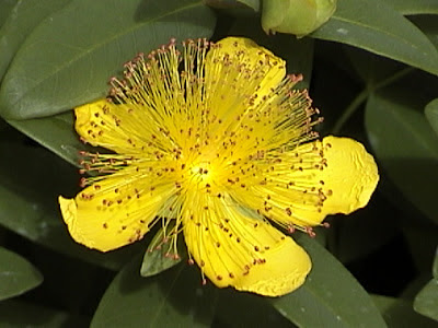
Yellow in all its glory . . . taken at the Butchart Gardens, Victoria, British Columbia.